Photo by Jay Joshi.
Since its opening in 2013, New York’s bike share program, Citibike, has become an increasingly important piece of transportation infrastructure for the city. The system has become especially relevant since the onset of the COVID-19 pandemic, which marked the beginning of a bike boom throughout the city as many New Yorkers sought an alternative to public transportation. The demand for Citibike has continued to grow since the early days of the pandemic, recently achieving its highest-ever day of bicycling this past September when the network reached a total of 135,000 rides in a single day.1
The growth of Citibike is very welcome news for those who are fans of more sustainable and equitable cities. Cycling is a very low-cost, environmentally friendly, and healthy form of transportation whose adoption can benefit individuals and society as a whole. For any who remain unconvinced, Transportation Alternatives’ 25x25 report does an excellent job of detailing the benefits that can be had from investing in cycling usage and infrastructure.
Given the increased popularity of cycling in New York, now seems like a better time than ever to explore the topography of the Citibike network. Thankfully Citibike’s system data is open to the public to analyze, allowing us to glimpse into its inner workings. Specifically, I wanted to answer a few basic question about Citibike’s geographical distribution: which parts of the city are covered, the capacity of these covered areas, and whether or not the network is reaching neighborhoods with median household incomes below the poverty line.
To answer these questions I wrote a simple Python script to extract a list of Citibike stations from their General Bikeshare Feed Specification (GBFS) API into a CSV file. Once exported, I plugged the data into QGIS, a popular open-source geospatial analysis tool, to derive the maps and analysis described below2.
Without further ado, let’s dive into the data!
What parts of New York are served by Citibike?
The most basic question to be answered from the Citibike data is which parts of New York are being served by the network. For the purpose of simplicity, I chose to make the assumption that an area is “served” by Citibike if it is within 0.5 kilometers from a docking station. This distance corresponds roughly to a 5-6 minute walk3, though is of course imperfect given that a radius around a station isn’t always the same as walking distance4.
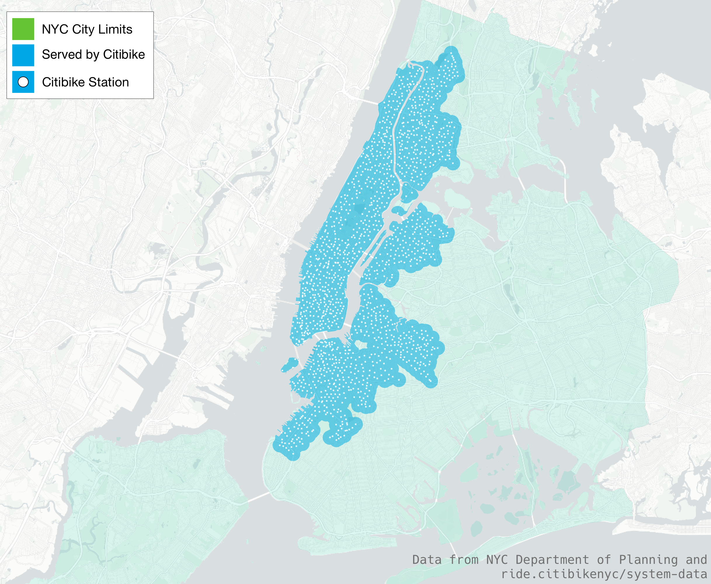
In its current state, we can see from the map that Citibike does a great job of covering Manhattan and the nearer parts of its surrounding boroughs. Unfortunately what’s left behind are large swaths of the outer regions of Brooklyn, Queens, and the Bronx. Using data from NYC’s mapPLUTO dataset, we can get more exact numbers about how many NYC households are “covered” by Citibike’s network:
| Borough | Total # of Households | # of Covered Households | Percentage |
|---|---|---|---|
| Manhattan | 945,067 | 944,865 | 99.9% |
| The Bronx | 559,049 | 276,894 | 49.5% |
| Brooklyn | 1,056,883 | 464,027 | 43.9% |
| Queens | 882,922 | 164,435 | 18.6% |
| Staten Island | 177,157 | 0 | 0% |
| Total | 3,621,078 | 1,850,041 | 51.09% |
While Brooklyn and especially Queens’ coverage leaves much to desire, the real disappointment is Staten Island. The borough’s omission from the Citibike network has been a long-standing controversy with many broken promises of inclusion.
Where is the capacity of Citibike stations the highest?
Now that we have an idea of what parts of the city are being served by the Citibike network, we can zoom in more by looking at the network’s capacity. Any user of Citibike will understand the importance of capacity if they’ve walked to an empty dock or biked to a station only to find there are no spots left to dock. While we shouldn’t expect capacity to be uniform throughout the city, it is an interesting metric to see which areas Citibike has focused its investments in infrastructure.
In order to measure capacity we’ll need to be a bit creative. While it may seem temping to simply add up the number of stations in each neighborhood, this method would operate under the flawed assumption that all Citibike stations are equal. In fact, each Citibike station can have a varying number of docking ports for parking bikes. Some have kiosks that allow customers to purchase bike keys, and others can have a temporary “bike valet” service during periods of high demand.
To simplify all of this complexity we’ll be gauging capacity in a neighborhood by measuring the number of docking ports in all of its contained stations. From there, we’ll normalize the number to a unit of “bike capacity per 100 square kilometers” in order to allow for easy comparisons between neighborhoods of varying size.
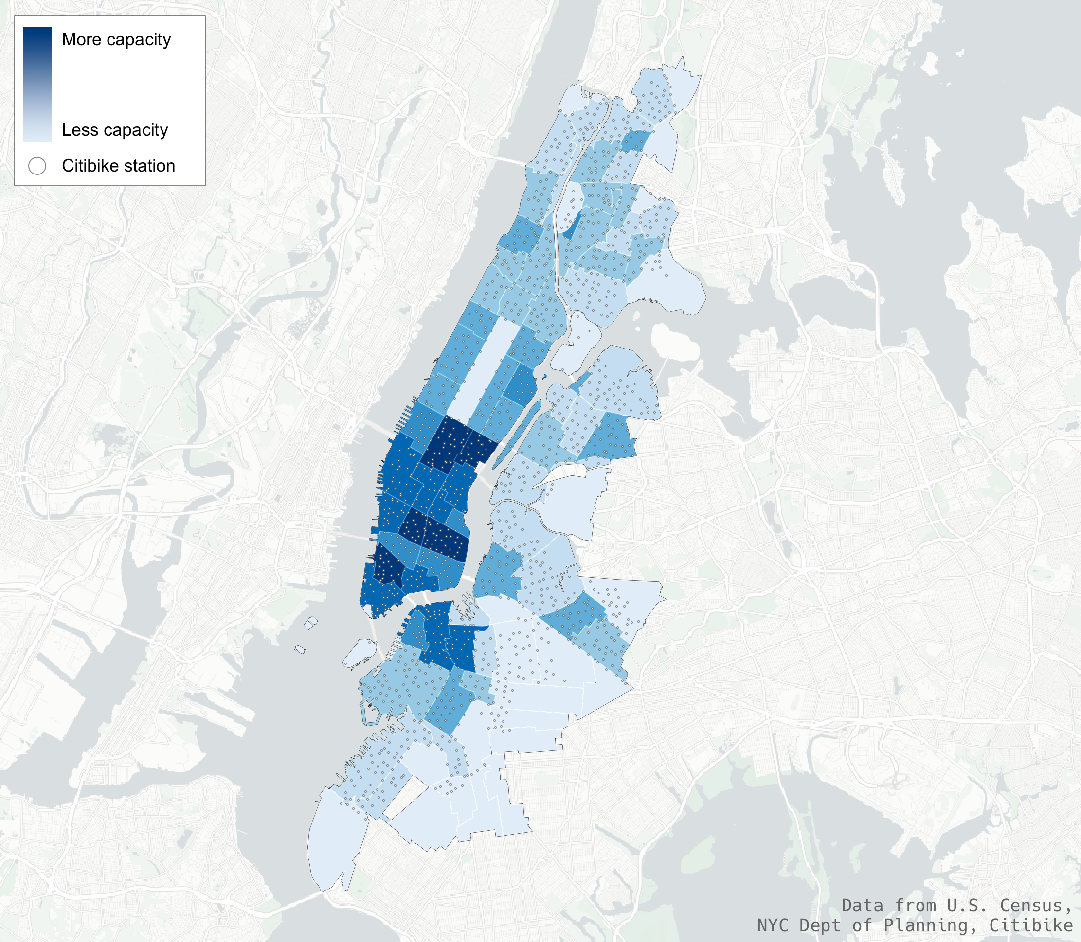
Looking at the results, we can see there is clearly higher capacity around neighborhoods with a higher density of business uses (eg Midtown Manhattan, the Greenwich/East Village, Downtown Brooklyn). My running theory for this decision is that these are neighborhoods with a high amount of commuting traffic. This means bikes will agglomerate into these regions in the morning and clear out at night as people bike to/from their lower-capacity residential neighborhoods.
Is Citibike serving less wealthy neighborhoods?
The final question we’ll investigate is whether or not the Citibike network is serving impoverished neighborhoods in the city. While access to Citibike may not be a universally make-or-break resource for households below the poverty line, at its reduced rate of $5/mo it can still be a valuable low-cost transportation option. This is especially true for people living in areas with limited public transportation options (ie along bus routes with low frequencies or unreliable on-time rates).
To properly answer this question I turned to data from the 2015-2019 American Community Survey by the U.S. Census to gather median income data for each neighborhood in the five boroughs. With the income data at hand, I filtered out all neighborhoods above NYC’s official poverty line of $35,0445 and joined it with the previously calculated “capacity per 100 square km” metric in order to ensure a proper comparison between neighborhoods. Here are the results:
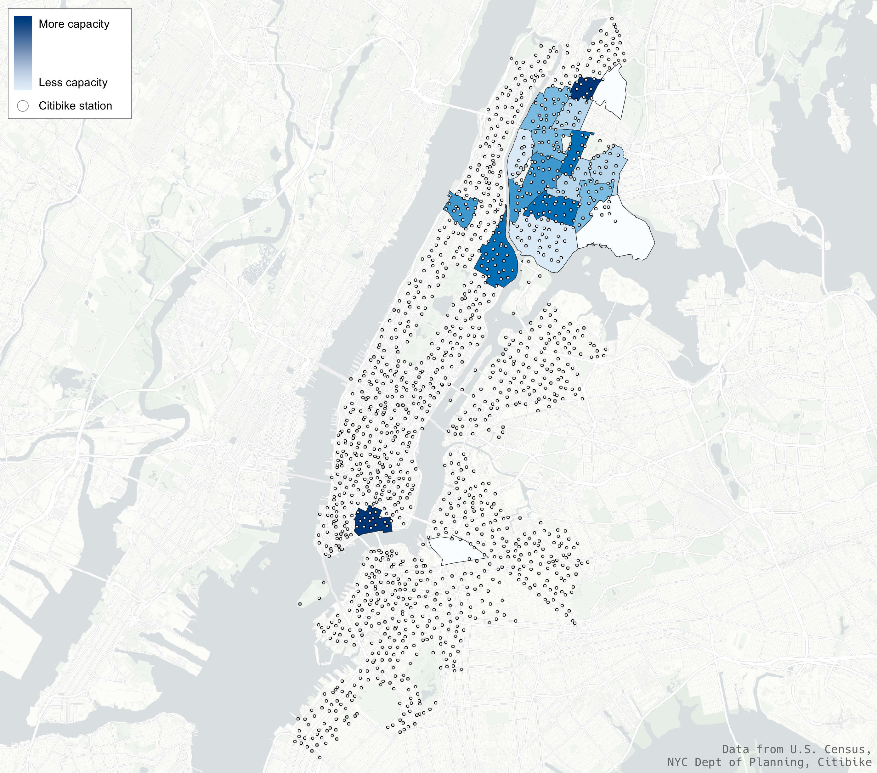
Fortunately the resulting map is not quite as vilifying for Citibike as I expected it to be. This comes in large part due to the 2020 expansion of the network into the South Bronx, which contains a majority of the poorest neighborhoods in the city. Their success in reaching lower-income neighborhoods is not universal, however. While the Bronx’s Hunts Point and Belmont neighborhoods do have Citibike stations within their borders, the capacity available is relatively low compared to each’s size. South Williamsburg in Brooklyn is also a notable omission, though in fairness to Citibike there is historical controversy over Citibike dock placement within this part of the neighborhood.
Overall, Citibike seems to have done a surprisingly decent job of covering neighborhoods below the poverty line. While their rollout hasn’t been perfect, it still is a step in the right direction towards providing an affordable and eco-friendly transportation option for more New Yorkers.
Hopefully this analysis has provided some interesting insights into the current state of Citibike’s network. Excitingly, this report may become increasingly out-of-date as the network continues to expand, both in terms of geographical reach and density. This, on top of an incoming administration who may be our first “Bike Mayor”, means it’s an exciting time for New York to make some real progress in moving away from its car-centric past towards a more sustainable, clean, and equitable future.
-
According to Citibike’s blog. ↩
-
For those who are curious, all data sources and the methodology used in generating this report are described here. ↩
-
Walking estimates are derived from Very Well Fit. ↩
-
Normally this sort of granularity can be handled with isochrones, however they become difficult to calculate when dealing with a high cardinality dataset like this. More specifically, the amount of calculation needed exceeds the free tier of the isochrone service I use 😅. ↩